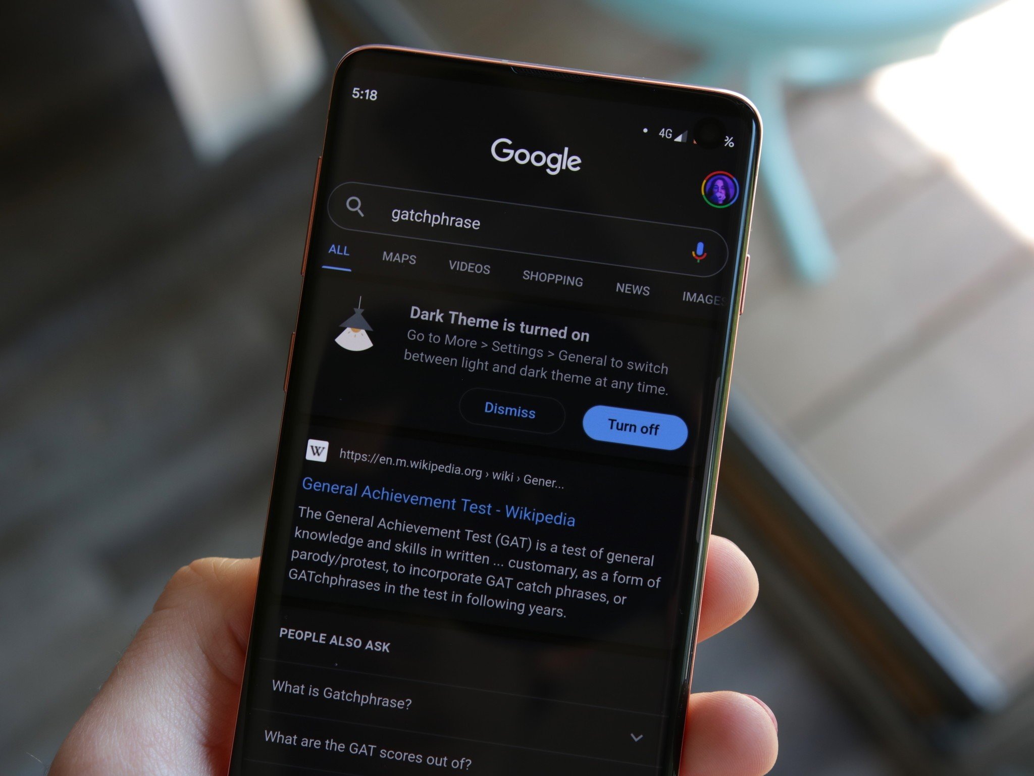
The Google design team has created a set of dark theme guidelines for other developers to learn from.
What you need to know
- Google has used dark grays to create low contrast themes that are easy on the eyes.
- The design team created a new color palette for Google Calendar.
- Google has published a guide on dark themes for app developers.
Google has been going all out with updating its apps with dark themes as of late. Surely, this is in preparation for Android Q, which will be the first version of stock Android to ship natively with dark theme support.
So far, we've seen a dark makeover of several of its most popular apps including, Google Calendar, Google Keep, Google Photos, and even Google Search, Assistant, and the Discover feed.
Now, thanks to a recent blog post from the Google Design team, we're getting a look at just how the dark themes came together for some of its most popular apps. The first thing we learned, is that creating a dark theme isn't the same for every app. Each app requires careful consideration of how it will be used and what it will display.
Google Photos, for example, decided to use a dark gray low contrast background, which allows for the colors in your photos to really pop. Google even put an emphasis on using soft grays and blues for the icons at the bottom to not distract from what is truly important — your photos. All of you photo or video editors out there are probably familiar with this color scheme from using Adobe products such as Photoshop, Lightroom, or Premiere.
When the team began working on the dark theme for Google Calendar, it quickly realized the color palette traditionally used in Material Theme did not match with the darker color scheme. This lead to the creation of an entirely new color palette consisting of different hues, ensuring your events will stand out while still looking natural and being easy on the eyes.
Google News posed a whole new scenario for the team, by using not only photos, but combining it with text. For this setting, the team decided to use the same dark gray from Google Photos, allowing the photos to shine. This also worked well with the decision to use light gray text to prevent a shocking change in contrast and make it more pleasant to read.
Android Auto was created to help drivers during their commutes and to cut down on distractions, because distractions on the road cause accidents. That's why a dark theme was especially important for Android Auto.
Whether you're driving in daytime or night, a dark theme is less intrusive than a bright white screen with colorful graphics. By utilizing dark grays, blacks, and a less vibrant color palette, drivers can focus on the road easier and only glance at Android Auto when needed.
The use of dark grays also helps in creating layers to separate elements of the UI, but Android Auto uses this sparingly in order to make navigating quicker and easier for drivers.
As Material Theme evolves and dark designs become more prevalent, Google has put a lot of thought into how to make the two work together. It has even published a set of dark theme guidelines for app developers to assist them in creating the best-looking apps possible. Hopefully, this leads to even more apps adopting a dark theme in the future.
Fade to black: Why Android's dark theme rumors don't matter anymore and matter more than ever


Tidak ada komentar:
Posting Komentar