Smart assistants are the closest things we have to robot butlers, and our houses are filled with them. Thanks to several hundred hours of testing, we're able to help you pick out the best experiences for your home.
Google Home Hub
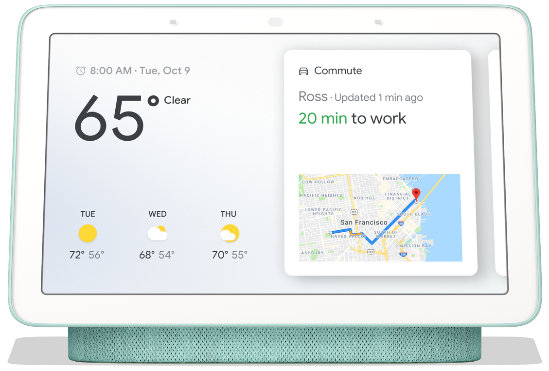
Blending in everywhere
Pros
- Stunning display
- Impressively compact
- Excellent touch features
- Superior voice commands
Cons
- Not quite loud enough for a noisy kitchen
Google's Home Hub is the first smart display I've wanted to put in other rooms in my home. The software is especially good when it comes to swiping through the menus, something you don't see much with smart displays.
Amazon Echo Show (2nd Gen)
Kitchen power
Pros
- Easily the best speaker on a smart display today
- Large, vibrant display
- Consistent Alexa experience
Cons
- Alexa command system isn't particularly intuitive
- Display doesn't do much yet
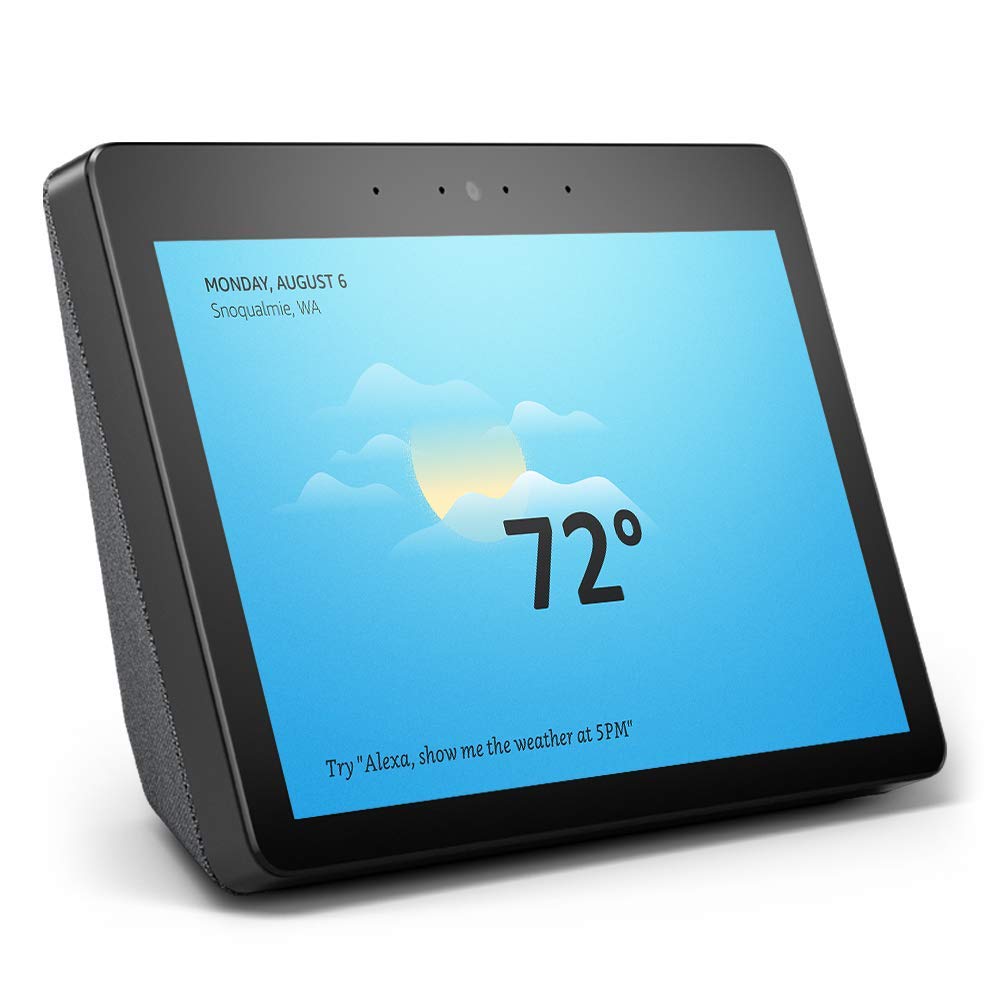
A huge upgrade from the original Echo Show, especially when it comes to the impressive new speakers. But unless you're watching a video or you want to see lyrics to a song you're streaming, the Echo Show display doesn't really enhance Alexa too much right now.
These experiences aren't all that different when it comes to day-to-day tasks, but the amount of work you need to do in order to get those experiences matters. This is especially true when it comes to making sure your assistant actually learns from your behaviors.
Defining "smart" in your display
Google and Amazon hope that, by purchasing one of these smart displays, you'll be hooked into that ecosystem for a long time. These smart displays are designed to be your hub for all of the other things on the network first, and entertainment devices second. That's why these displays are so commonly found in kitchens and living rooms, the whole point is to make sure you're able to either speak or reach out and touch these things when you are at your busiest, but make it clear what you really want is an inexpensive way to make it so Google or Alexa can hear you no matter where you are.
The good news for Google and Amazon is, for a certain group of people, this plan is working. What is particularly interesting about this plan is how differently these two companies are approaching that "hub" experience through hardware and software.
| Google Home Hub | Amazon Echo Show (2nd Gen) | |
|---|---|---|
| Display | 7-inch LCD | 10.1-inch LCD |
| Speaker | 15W | 2 x 10W and Dolby processing |
| Ambient light sensor | ✅ | ❌ |
| Connectivity | 802.11 a/b/g/n/ac | MIMO 802.11 a/b/g/n/ac + 802.15.4 |
| Power | 15W Adapter | 30W Adapter |
| Camera | ❌ | 5MP |
Amazon's Echo Show is a clear winner if you want a kitchen appliance. It's way louder, the display is larger, and it is designed to take up a fair bit of space. Google Home Hub doesn't do super well in the kitchen because it's easy to cover up the comparably small display and the speakers aren't as good. But just about any other room in the house, the Home Hub is going to offer a much better experience. It's a fantastic living room photo frame until you need it for smart home things, a fantastic bedside clock that transforms into a full assistant when you need it, and a decent office display for when you want to watch a little something while you work. I wouldn't want the Echo Show in any of these places, because the display is distracting even when it is dim and the camera on the front causes some privacy concerns with Drop In enabled. You can disable that instant calling feature, but in the kitchen I really like it.
Unfortunately, the biggest differences between these two smart displays exist because of petty dividing lines in ecosystems.
A big part of what makes the Google Home Hub really stand out is the display. This compact design houses and incredibly well tuned display with an ambient light sensor to help it sort of fade into the background when not in use. As a digital photo frame, it's fantastic because most of the time it really looks like a photo in a frame. Amazon's Echo Show, by comparison, always looks like a little TV and demands your attention as you walk through a room. This is useful in some places in the house, but not all of them.
Unfortunately, the biggest differences between these two smart displays exist because of petty dividing lines in ecosystems. Amazon's streaming services can't be sent to a Home Hub via Google Cast, and Google's streaming services for music and video are painful to get working on an Echo Show by design. These companies intentionally screw one another over so you're compelled to use one over the other entirely. But even without those dividing lines, there are things Google Home Hub does much better when it comes to entertainment. If I say "Hey Google, play the next episode of Game of Thrones" it knows to check and see what episode I wanted last and play the next one. Ask an Echo Show to do the same for The Man in the High Castle on Amazon Instant Video, and nothing happens.
The software differences between Google and Amazon don't end there. Home Hub does a better job making it so you can quickly look at individual rooms in your home for smart hub controls, and allows you to run it all by touch as well as voice. This is particularly helpful when your Home Hub is your bedside screen, as you can control things like the thermostat without waking up the other person in bed with you.
Google Home Hub
Blending in everywhere
Easily the best smart display for every room in the house except the kitchen.
Google's Home Hub is the first smart display I've wanted to put in other rooms in my home. The software is especially good when it comes to swiping through the menus, something you don't see much with smart displays.
Amazon Echo Show (2nd Gen)
Kitchen power
The best sounding smart display you can buy today, and ideal for the kitchen.
A huge upgrade from the original Echo Show, especially when it comes to the impressive new speakers. But unless you're watching a video or you want to see lyrics to a song you're streaming, the Echo Show display doesn't really enhance Alexa too much right now.


Tidak ada komentar:
Posting Komentar