Changes are coming to Google Play Music at this year's Google I/O, and here's our wishlist.
Google I/O is less than two weeks away, and while there are a great many Google products and services hopefully seeing some big updates during the coveted keynote, few services are expected to see as drastic and possibly game-changing updates as Google Play Music. Google Play Music could see a lot of changes — or even complete replacement — on May 8th, so while we wait to see what we're getting, let's recap what Google Play Music needs.
App layout overhaul with a streamlined or compact layout
Google Play Music received its last overhaul back in 2013, when it traded a black and blue Holo UI for a white and orange Material Design UI. The app needs to be redesigned from scratch at this point, but the biggest things that need fixing are these:
- Reprioritize the hamburger menu or ditch it for bottom tabs like YouTube and Spotify have. Tabs would require Google Play Music to seriously scale back on the sections, because right now things are bloated, cluttered and downright crazy.
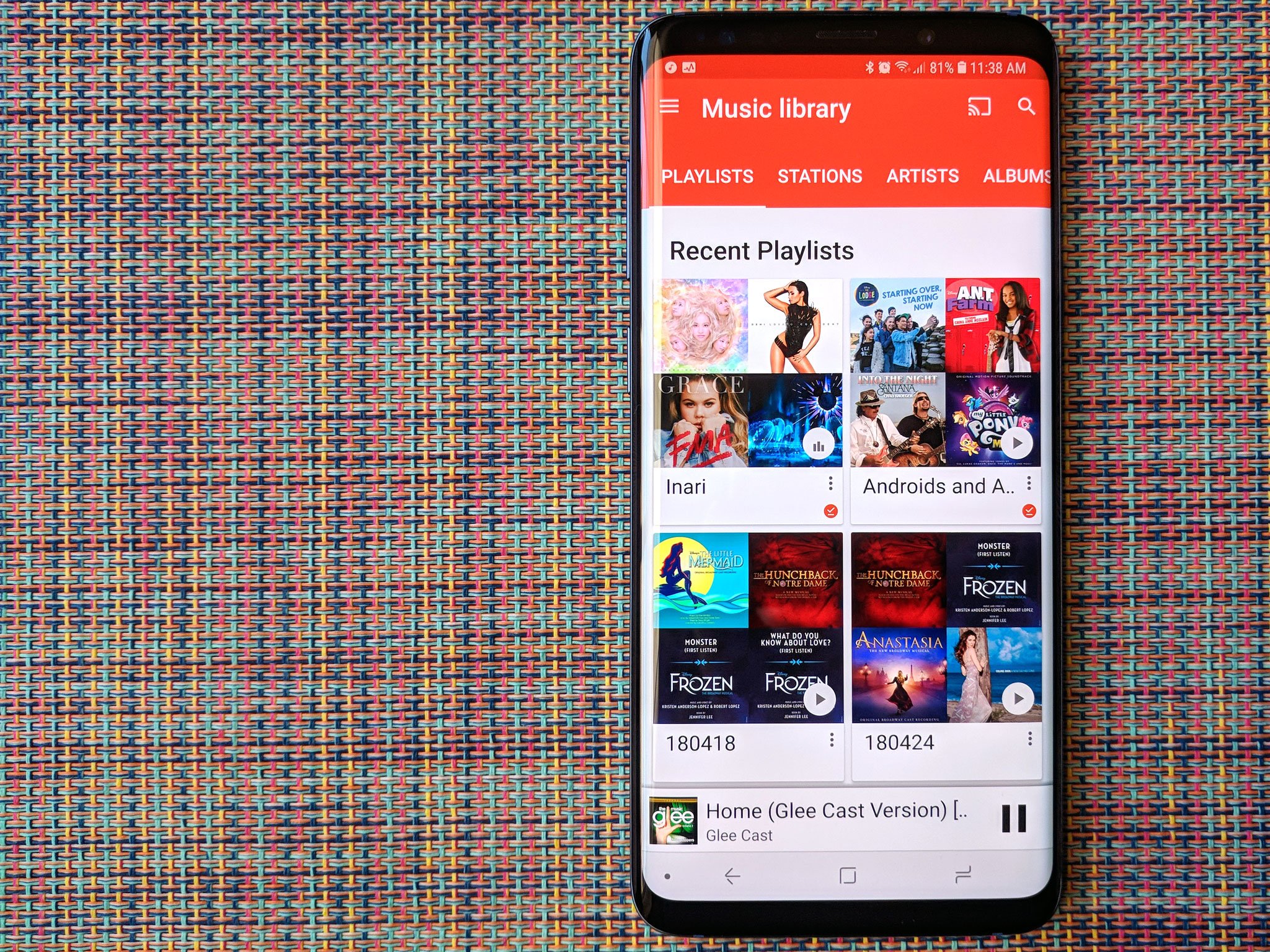
- Streamline and condense the UI to showcase more on screen at any given time, switching from large, album-collage thumbnails to a more compact list form on many sections of the app like Recents, Playlists, and Albums, which can become downright painful to scroll through with a developed library.
- Speaking of scrolling, scrolling and menu controls overlap on Google Play Music to the point that it's damn near impossible to add songs from the Songs section of My Library to a queue or playlist. Switch to a better scroll bar or a jump list like Action Launcher's Quickdrawer
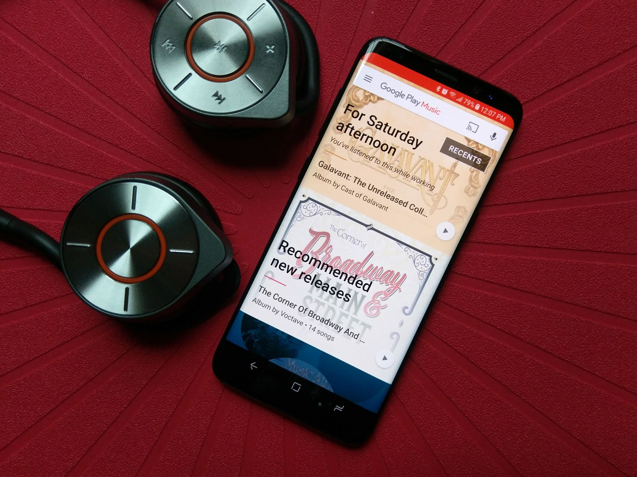
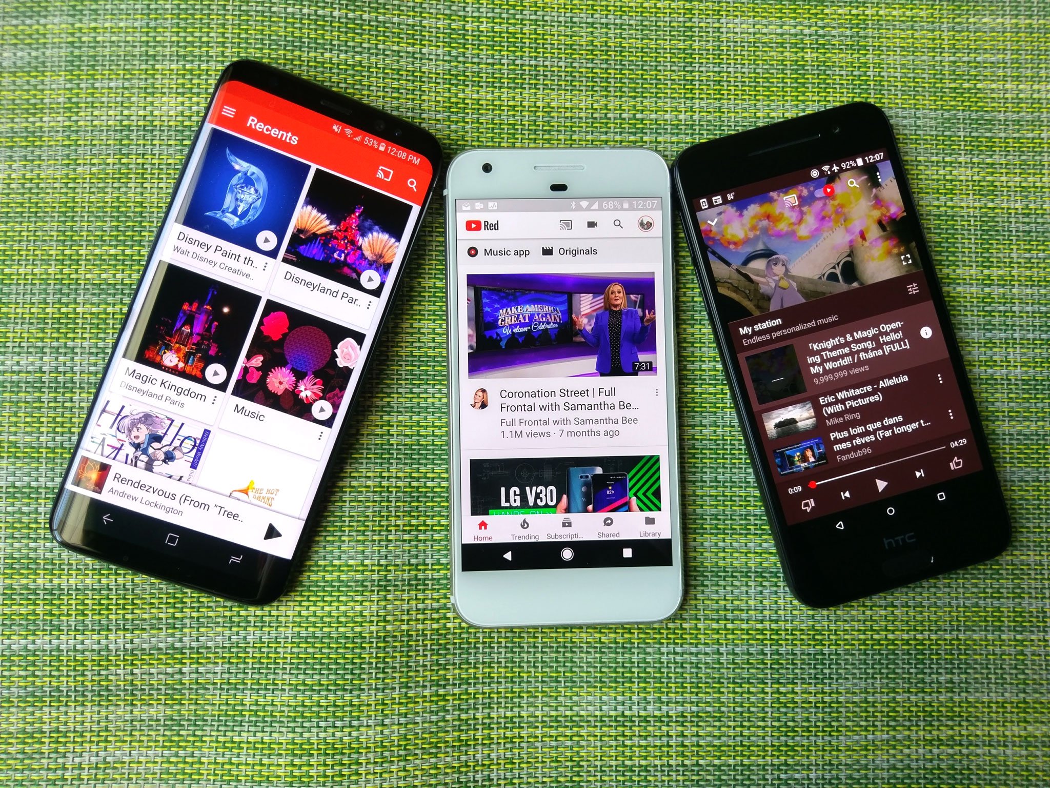
- Completely replace the Home page. The bold banners suggesting stations, new releases, and music we've listened to around this time before are way too big and completely ignored by a large section of users. Make the Home tab a medley of Recently Played, suggested stations, and recommended releases, like YouTube's home page.
The playback screen on Google Play Music is so in need of an overhaul that it gets its own section, because the way Google Play Music does its Now Playing screen is widely hated and has several highly noticeable problems:
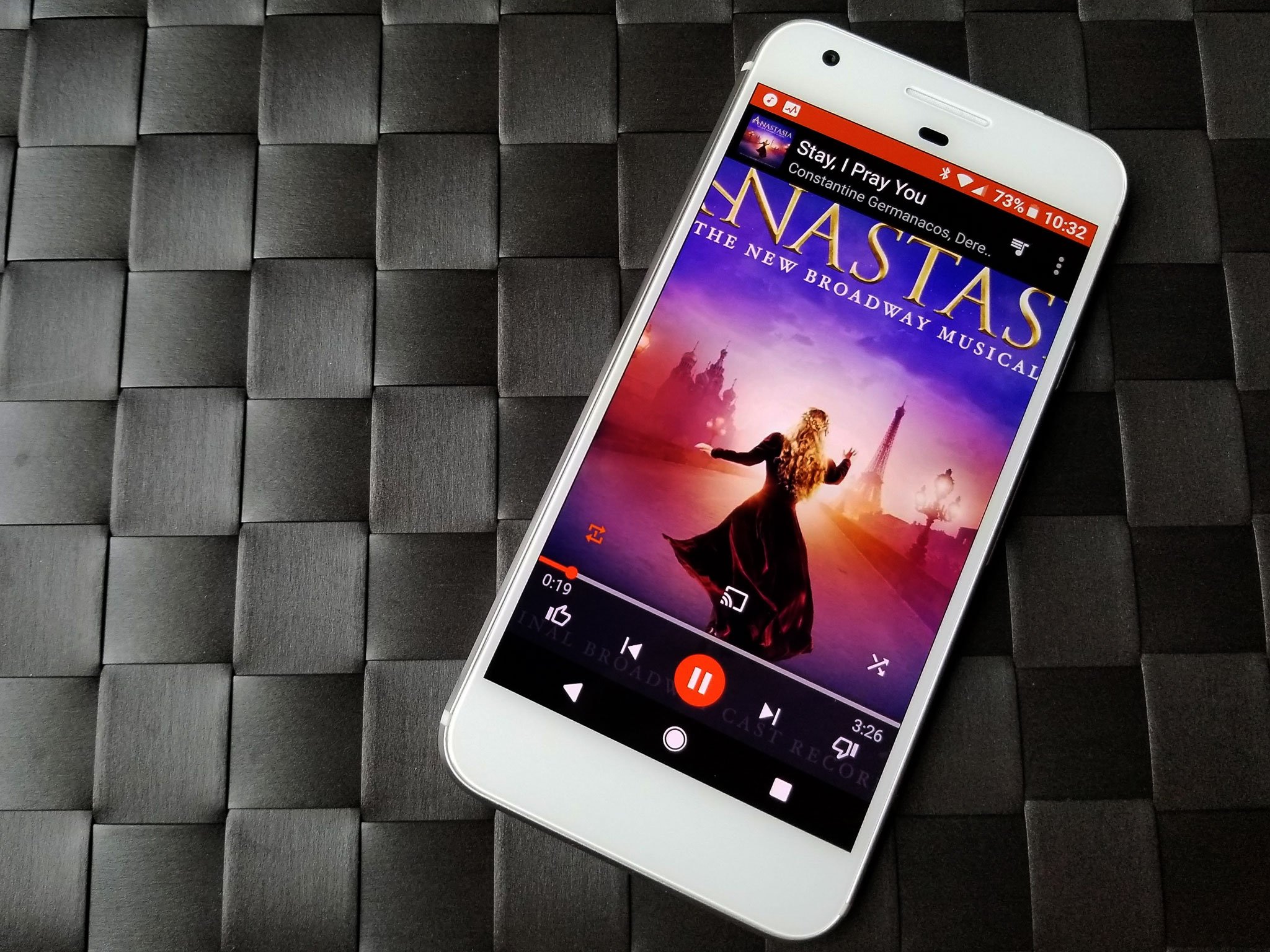
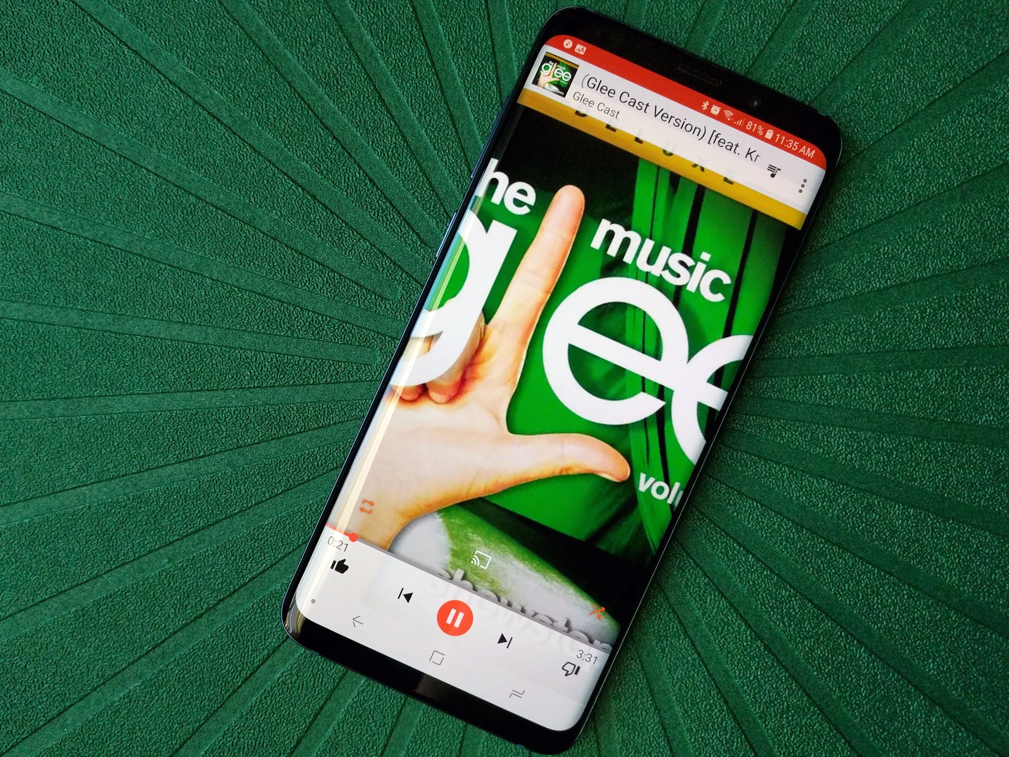
- Album art is zoomed in to fill the full screen, regardless of the opaque top and bottom bars of the screen containing the track information and track controls that cover up part of the album art, often leading to awkward crops of artist's torsos, arms, or legs. This is especially noticeable on extra tall devices, which are becoming more and more prevalent.
- The track controls are split between the opaque bottom bar and sitting above that bar within the album art. This means that the Shuffle, Repeat, and Google Cast icons can be obscured or completely lost in bright or busy artwork.
- The seek bar is a thin orange/white line that runs at the edge of the bottom bar and the artwork, saddled right between all the other track controls, which can be accidentally hit while trying to tap a point to seek to. The seek bar is so thin that it's easy to miss, meaning that when you swipe to seek you could accidentally swipe to the next or previous song.
 A vision of lovely darkness, brought to you by Substratum.
And last but not least, I've been begging since 2013, and I don't intend to get up off my knees and stop until I have it: for the love of Duarte, give Google Play Music a dark theme. A good dark theme is easier on the eyes for after-hours listening, a true black dark theme can help AMOLED phone users eke a little more out of their battery during a jam session, and if you don't think a dark UI doesn't look readable or sexy, just ask Spotify.
Better multi-device handoff and Chromecast stability
We can listen to Google Play Music on a wide, wide array of devices, but we can only listen on one at a time. However, your queue is unique on every device, and if you want to start listening to a queue on your phone and keep listening on your computer once you get to work, you'll have to save it as a playlist, rather than being able to move your current queue from one device to another like Spotify does with Spotify Connect. It's a small feature, but one that would be absolutely heavenly to have.
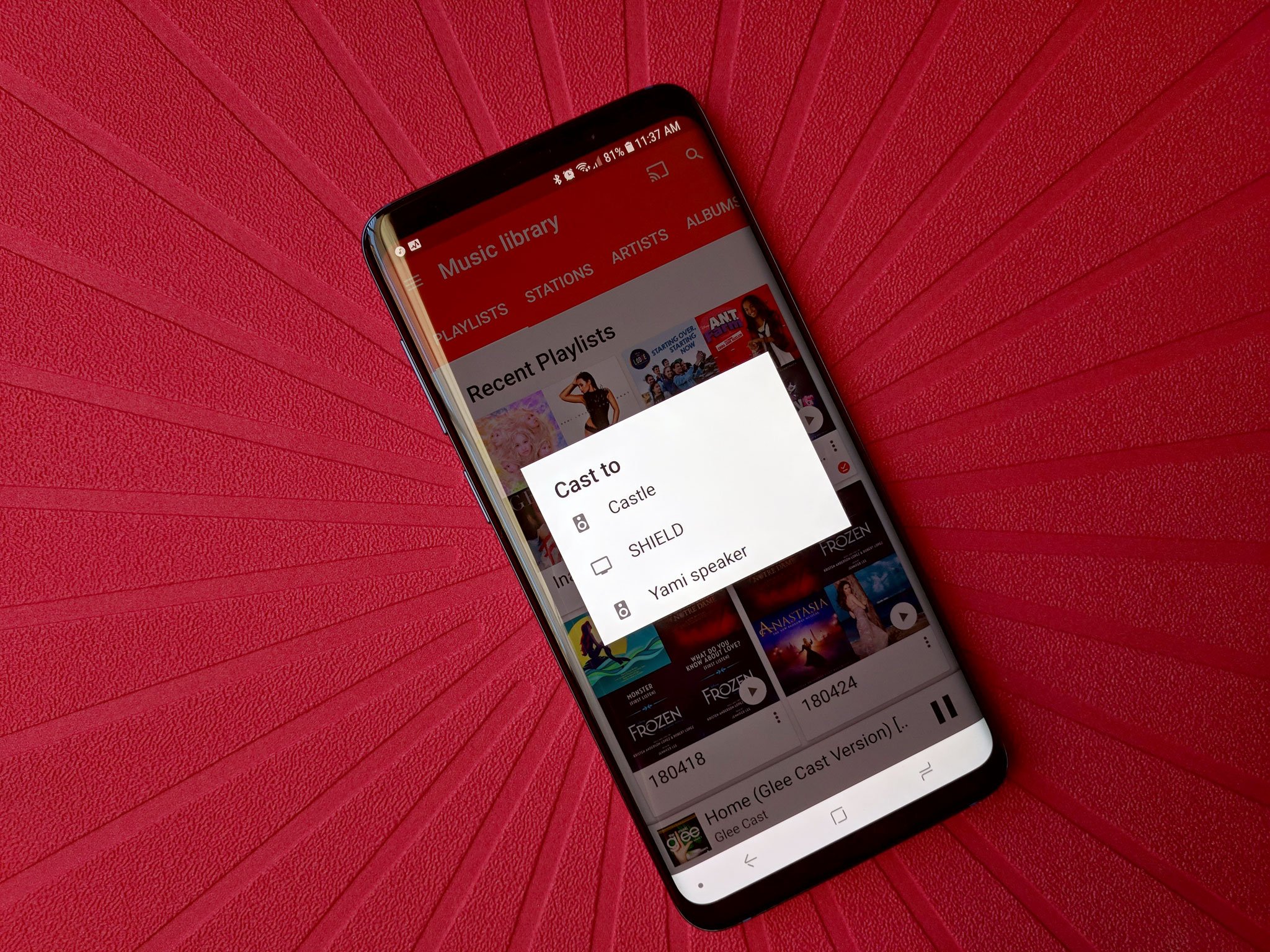
Speaking of device handoffs, Google Play Music was one of the launch services for Chromecast. How is it possible to still have this many issues streaming music this many years later? Google Play Music still skips random songs in playlists on a weekly basis, and good luck casting any songs longer than 15 minutes.
Device policy and upload/download changes
I accept having a device limit. I do. I even understand having a specific limit on phones, as much as it hurts someone like me who goes through a lot of them. But the device policy on Google Play Music needs to be revisited for a few very important reasons.
- Your computer can be counted twice because both the web extension and Music Manager count as an activation.
- Devices that can't download/upload to your Google Play Library can still count against the ten device limit, like Android Wear 2.0 watches and Android TVs.
- Almost every Android phone or tablet that ships Android has Google Play Music on it, and it can often activate itself before you have a chance to go disable it.
If you burn through your 10 device authorizations (and 4 deauthorizations) with phones and tablets and watches and TVs, you could not have a way to upload new music or download what is already rightfully yours, since you can only do so on a computer.
Let me repeat that: if you run out of device authorizations and de-authorizations, you can be locked out of downloading music you own.
Being unable to upload or download music from our library on the device we use most also needs to be rectified. Local-only songs cannot be added to playlists or casted. We shouldn't need an old-looking and old-acting Music Manager or Chrome extension in order to add songs to our cloud library and cast them.
But really, all we really want is a little stability
The future is uncertain for Google Play Music. That much is clear. Google Play Music could get replaced at Google I/O. Google Play Music could get merged with YouTube or YouTube Music in some unholy Frankenstein magic. Google could be completely overhauling the service and changing everything we thought we knew about the service.
We just don't know. And that's scarier than things staying the way they are right now.
A music subscription is a vital piece of most users' mobile lives. We wake up to music; we brush our teeth to music; we get through the day without taking a tire iron to our enemies and annoyances thanks to music. Music makes us better, and it's too important a service to be hanging in limbo like this. With as little change as Google Play Music has seen in the five years since the last major update, no small number of users have jumped ship to other services that seem to be growing and improving while Google Play Music just sits there and bloats, like a belly-up orange-and-white goldfish.
Updated April 2018: This article has been updated, overhauled and refined ahead of Google I/O 2018, which is where we hope Google Play Music will be similarly updated, overhauled and refined.
Tidak ada komentar:
Posting Komentar